OptiDesk.

Building OptiDesk. Replacing my dad's carbon-copy billing pad with an app, one entry at a time.

Role
Founder · Design, Engineering, GTM
Stack
Flutter · SQLite · offline-first
Status
Piloting at a real shop counter
41
screens through a scored design review
44
QA findings raised and closed pre-pilot
3
taps from walk-in to WhatsApp bill
0
servers. All data stays on the shop's phone
1
shop live, the one it was built inside
Before day one

The counter that started it

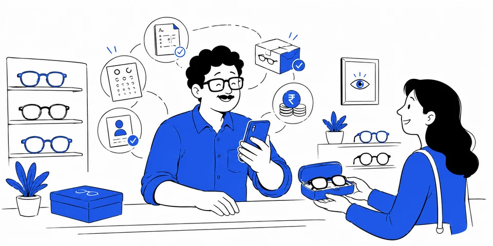
My dad runs an optical shop in Delhi. Every bill is written on a carbon-copy pad. Eye-power prescriptions live in a drawer of paper slips. When a customer calls to ask about their pending balance, someone flips through the pad. Billing software exists, but it is built for a different shop than his: GST-first, PC-and-printer-first, online-first. An optical counter needs exactly four things done fast, with no internet and no computer: bill, prescription, order status, pending balance.

So this log is not about an app idea. It is about one real counter, and whether I could take a product from nothing to real bills flowing through it, alone, for the first time.

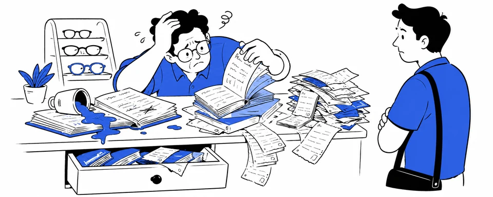
A shopkeeper buried in carbon-copy bills
01

Carbon copies fade. Records vanish.

One spilled chai, one lost pad, and a year of billing history is gone. There is no search, no totals, no proof of anything.

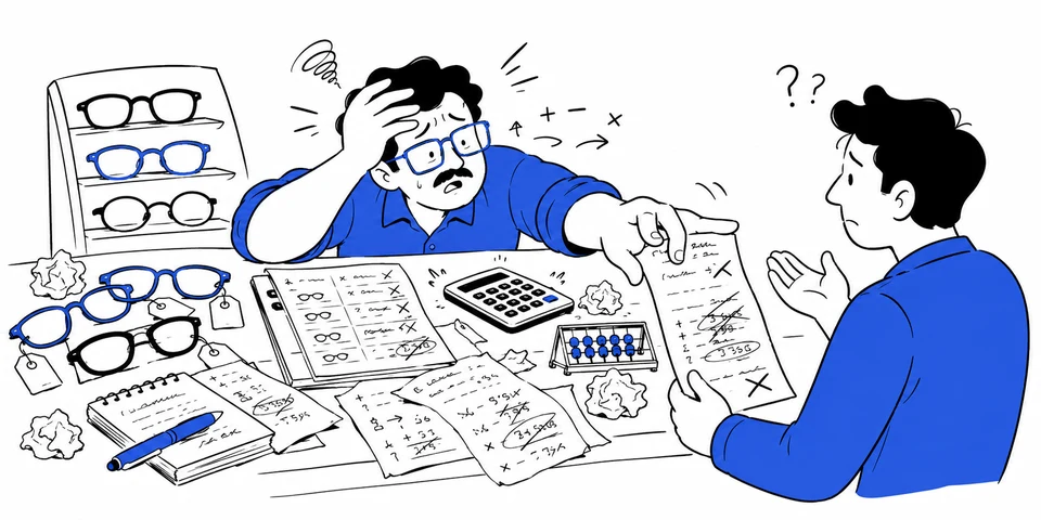
A shopkeeper lost in mental maths
02

Every total is mental maths.

Qty by rate minus discount, amount in words, again and again, all day. One slip and the bill is wrong in the customer’s hand.

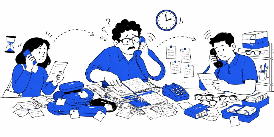
Customer, shopkeeper and lab stuck on the phone
03

“Bhaiya, chashma ready hai?”

Every order status lives in your head. Customers call you, you call the lab, and everyone waits on everyone else.

A calm shopkeeper handing over glasses
04

OptiDesk remembers all of it.

Bills, eye powers, order status, balances due, customer history. Typed once, kept forever, found in one search.

The problem, as the pitch site tells it. Scroll and the cards stack.

The log

Dated entries, written as it happened

Forty-one screens, five judges

Before writing production code, every screen went through a review panel I built for myself: five expert lenses (UX, product, business ops, SaaS patterns, UX writing), each scoring 0 to 10. Nothing passed under an average of 9.5, and one open high-priority issue meant automatic failure regardless of score. All 41 screens went through it. Some took five rounds.

The bar caught things I would have shipped without blinking: an invoice flow that assumed customers have email addresses (most walk-ins do not), money amounts styled three different ways, a delete action one tap from data loss.

The call

Solo founders have no design critique, so I manufactured one and gave it veto power over my own work. The discipline mattered more than the score: a hard gate you cannot argue with beats taste you can rationalize around.
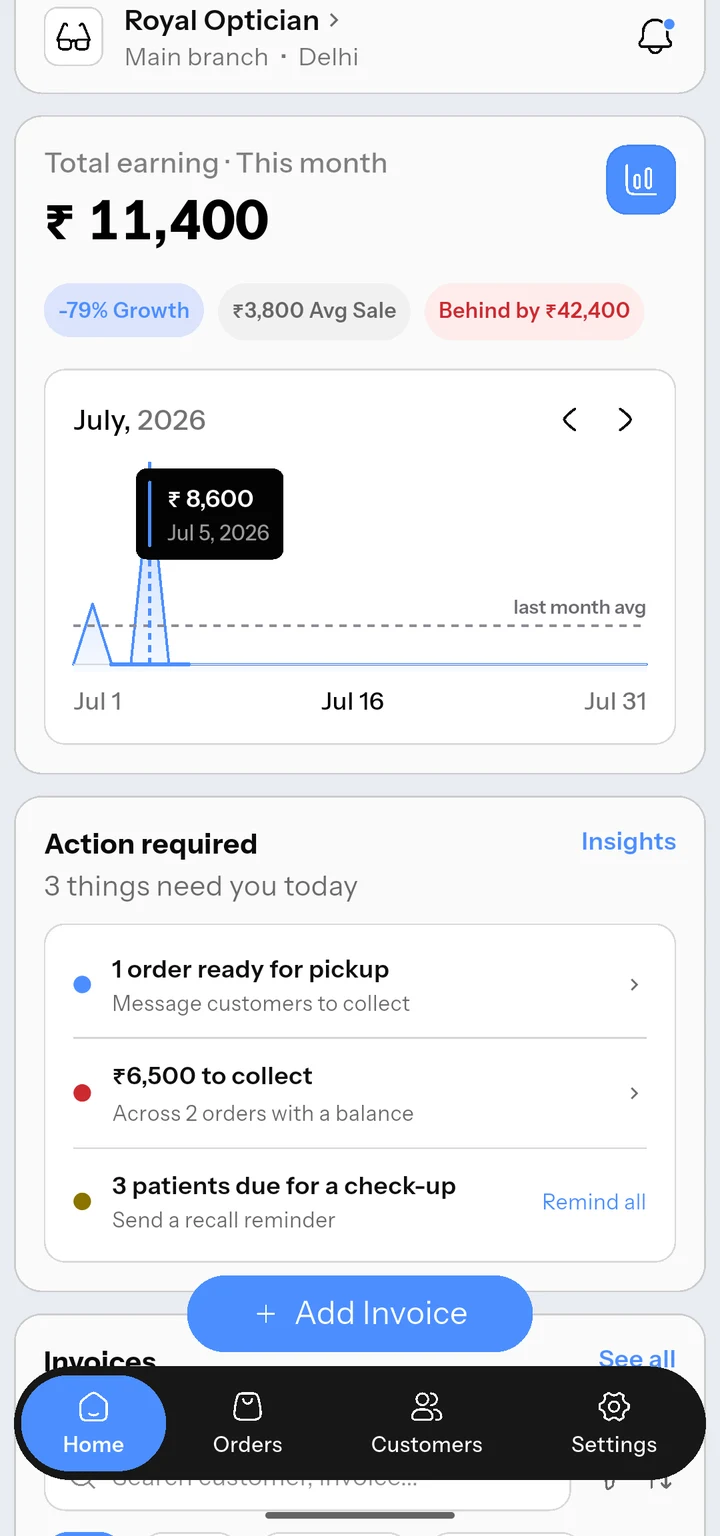
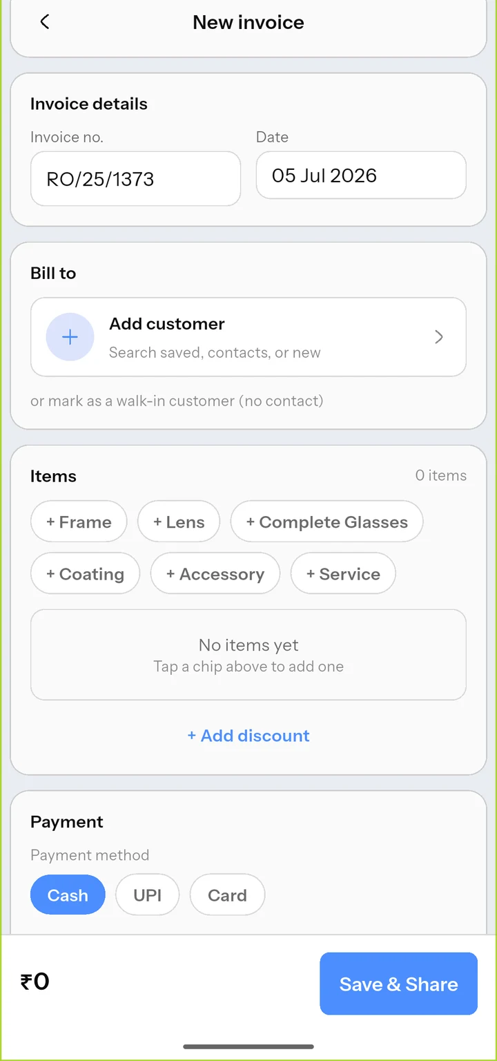
Home: the billing desk
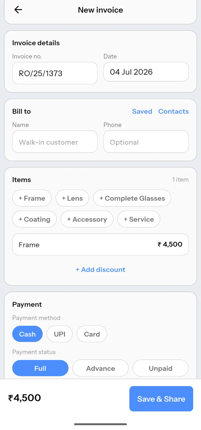
New invoice flow
New customer form

Three of the 41: the billing desk, a new invoice, a new customer.

The design system is a lint rule

One person cannot hold a design system in their head across 41 screens and months of changes. So the system does not live in my head. Every color, spacing value and radius is a named token, and custom lint rules fail the build if a screen uses a raw hex color or an off-grid gap. When a padding value needed to change app-wide, it changed in one line.

The call

Enforce taste with tooling, not memory. A rule that fails the build outlives motivation, and it is why screen 41 looks like screen 1.

/// 4px spacing grid (STRICT). Every gap/padding/margin must be one of these. abstract final class AppSpace { static const double s4 = 4; static const double s8 = 8; static const double s12 = 12; static const double s16 = 16; /// Text-field content inset. One rule for EVERY text-entry control, /// so a name field and a payment box share one left offset. /// Dropped 12 -> 8: one change, every field in the app follows. static const double fieldInsetH = 8; }

tokens.dart: the single source of truth, enforced by custom lint.

Strategy and a pitch site in one day

Positioning came before features: "the paper pad, upgraded, not replaced by a computer." Shop owners do not want software. They want their pad, minus the drawer of paper. That one sentence decided what OptiDesk refuses to be: no GST module, no inventory, no login screens. By midnight the pitch site was live, with a pilot funnel and pricing strategy written down.

The call

Deciding what notto build was the day's real work. Every feature a competitor has and my user does not need is speed I get to keep.

The pitch site, top to bottom: shipped the same day as the strategy. Live at optidesk.app.

Three rounds of QA, forty-four findings

I tested the app the way a shopkeeper would break it: typing a phone number into the name field, backing out mid-bill, restoring a backup over live data, killing the app during a save. Three full review rounds produced 44 numbered findings. Every one got a one-commit fix and a re-test before it counted as closed.

Honest entry: one fix got shipped, then reverted, then redone differently. A cosmetic fix behind the main billing button quietly re-opened an older bug where tappable chips got covered. On-device testing caught it. The final version keeps the clean look and guarantees nothing tappable can ever be trapped under the button.

The call

A fix that reopens an older bug is worse than no fix. I keep every finding numbered and re-testable, so a regression has to answer to a paper trail instead of my memory.

F-32A new customer could silently take over another customer's phone number. The upsert was keyed on phone. Now it warns and shows the number's real owner instead.
F-33Garbage typed as a phone number saved clean and left a live-looking Call button that dials nothing. Blank stays legal (walk-ins), typed values must be diallable.
F-35Two customers with the exact same name saved as indistinguishable rows. Now it soft-warns and offers the existing record, but same-name stays legal because same-name customers are real at a counter.

Three of the 44, verbatim from the findings ledger.

Filming an app that lives on a counter

A demo video for shop owners cannot be a screen recording with a mouse cursor. I recorded the real app on an Android emulator with scripted, deterministic taps: seeded shop data so the charts look alive, a cleaned status bar, visible tap indicators. Then the surprises: the emulator records video that plays back 1.5x too fast, and dismissing the keyboard silently eats the next tap, which ruined take after take until I found the cause.

The call

When a take failed twice the same way, I stopped re-recording and instrumented the problem instead: probed exactly which tap vanished, found the keyboard focus quirk, and changed the method. Debugging beats retrying.

The real thing: a walk-in billed and the PDF shared to WhatsApp, unedited app footage.

A demo you can send on WhatsApp

Optician shops share things one way: WhatsApp. So the demo page treats video timestamps as URLs. Every question in the FAQ answers with a link that opens the demo at the exact second that answers it, like optidesk.app/demo#order:16. One shop owner can forward another a link that says "see, this is how the order tracking works" and it just plays that moment.

The call

Distribution shaped the feature: the demo page is built for being forwarded, not for being browsed. Every timestamp lives in one data object, so when the videos get re-edited, retiming the whole page is one edit.

The actual demo page, live and interactive, shrunk to fit the log. Or open it full size.

Next: real bills

The pilot build is on the counter at Royal Optician, the shop this whole thing was built inside. The next entry is not mine to write at a desk. It gets written by whether my dad and his staff reach for the phone or reach for the pad when the shop gets busy. Activation, weekly bills, time per bill: those numbers will fill this space.

This entry is intentionally unfinished.

Reflection

What building alone actually taught me

This is the first thing I have taken from zero to production scale alone: product decisions, design system, Flutter code, QA discipline, go-to-market, demo production, the pitch site. Not a mockup handed to a team. The whole thing.

I worked with AI throughout, and the honest framing is this: AI moved at the speed I decided. Every review bar, every finding that counted as closed, every "this is wrong, redo it" was my call. What that built in me is the scarcer skill: directing work, judging quality, and owning outcomes when there is nobody else to blame.

The three habits I am keeping: gates I cannot argue with (the 9.5 bar), evidence over confidence (nothing counts as fixed until re-tested on device), and deciding what not to build before deciding what to build.