Transforming a broken directory into an immersive
‘Digital Heritage’ experience — bridging the gap
between physical prestige and digital trust.
This project's solution cycle is still under development. The scope has been expanded — what you see here represents one complete iterative design cycle.
Trust → Heritage
Convert 70 years of legacy into digital trust before asking for admissions.
Directory → Narrative
Replace complex menus with a guided ‘Gat Bhava’ scroll experience.
Static → Immersive
Atmospheric UI that makes users feel they’re walking through the academy.
The Transformation
The original interface suffered from cognitive overload and a lack of hierarchy. Our redesigned approach transformed the entry point into a focused, visually guided narrative, immediately establishing trust and cultural resonance.
Sangeet Niketan, established in 1950, is one of Delhi's oldest chartered institutions for classical music and dance. For seven decades, it has trained over 15,000 students under the Guru-Shishya tradition. While their physical reputation is legendary, their digital presence was nonexistent — the existing website was broken and outdated, failing to capture the prestige of the institution.
My goal was to transform a static directory into an immersive “Digital Heritage” that reflects the academy's soul without losing its traditional roots.
Increase Trust
Convert heritage into trust before asking for admissions (the primary funnel).
Reduce Cognitive Load
Simplify navigation to improve discoverability of courses and results (the IA goal).
Drive Engagement
Use emotional design and unique interactions to increase time-on-site.
Systemic Diagnosis
Our initial Heuristic Evaluation revealed that the site wasn't just visually outdated; it was functionally broken. Critical flaws included a validation void (no testimonials or recognition), broken utility (non-functional notice board and social links), and a narrative gap (the site failed to communicate the cultural impact of the academy).
| Page | Identified Issues | Missing Features | Improvements | Objectives |
|---|
| Homepage | - Lacks flexibility and responsiveness
- Too much redundancy
- Poor choice of hierarchy
- Lacks interaction and updates
- No effective use of transitions or scroll animations
| - Basic utility links (social media, contact email)
- Updated design for modern aesthetics
- Clear call-to-action elements
| - Improve navigation and hierarchy
- Add transitions for better engagement
- Ensure responsive design
| - Enhance user interaction
- Ensure modern, responsive design for broader accessibility
|
| About Us | - No user feedback mechanism
- Text-heavy layout
- Poor visual language
- Outdated information on institutes and facilities
| - Testimonials
- Visual storytelling of institutes and facilities
- Updated profiles of founders and faculty
| - Include user testimonials
- Add a dynamic, visual timeline for achievements
- Update faculty details with recent contributions
| - Showcase the organization’s credibility and accomplishments
- Improve visual appeal and engagement
|
| Academics | - Poor organization
- Overwhelming amount of text
- Lack of interactivity
- No structure for course details
| - Course structure and fees
- Guidelines for exams
- Event calendar for students
| - Organize content under tabs
- Add course-specific pages
- Include an interactive calendar for events
| - Provide clear, concise academic information
- Enhance navigation for students
|
| Gallery | - Outdated images
- Poor loading times
- Irrelevant content
| - Dynamic photo albums
- Event-based categorization
- Better compression for images
| - Update with high-quality, relevant images
- Organize images by events
| - Create an immersive visual experience for visitors
- Highlight recent events effectively
|
| Notice Board | - Not clickable
- Outdated notices
| - Dynamic updates for events and schedules
| - Add a scrolling banner for important notices
- Create a categorized notice archive
| - Ensure timely updates for users
- Provide easy access to important announcements
|
Research
Understanding the Landscape
Competitive Analysis
I conducted a comprehensive audit of 9 direct and indirect competitors (including Tarana, Artfills, and Kathak Kendra), evaluating them based on Visual Hierarchy, Cultural Resonance, and Information Architecture.
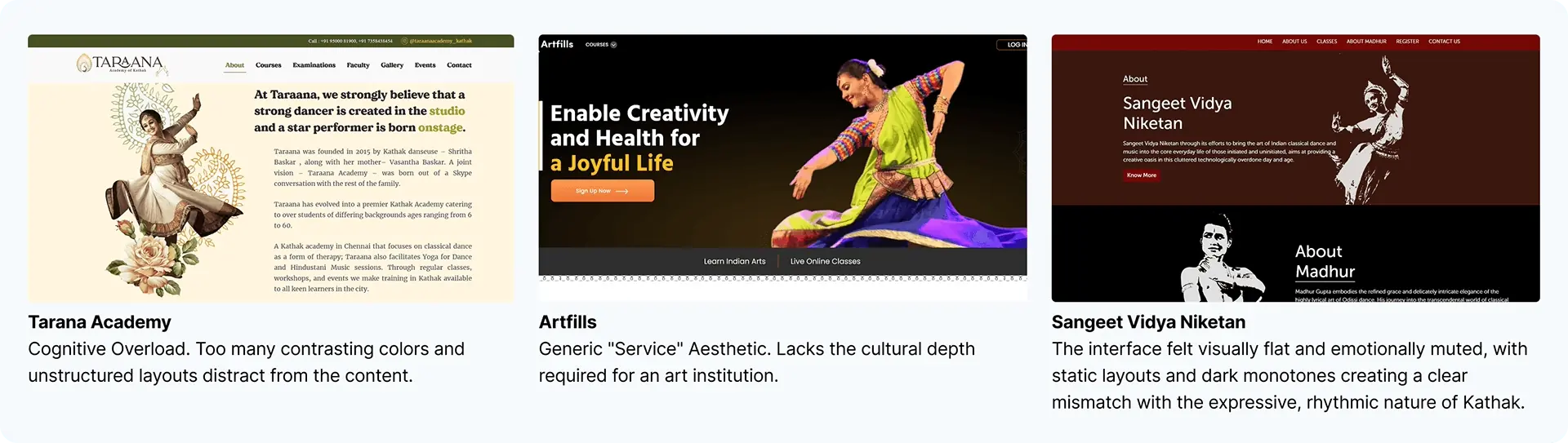
Competitive Landscape: Tarana, Artfills, Sangeet Vidya Niketan
The Verdict: The market was monotonous. Most sites treated Indian Classical Dance like a corporate service — clean and sterile. While functional, they lacked the Rasa (Emotion) and Texture required for a heritage institution.
Feature Synthesis
Despite the generic aesthetics, specific competitors offered valuable interaction insights. I moved beyond visual criticism and conducted a Feature Synthesis to identify successful patterns — features that solved specific user needs like timeline visualization for history or video headers for engagement.
| Competitor | Feature Analyzed | The Gap (Insight) | My Adaptation (Solution) |
|---|
| Keelaka | Bold Texture Overlays | Modern "Grunge/Edgy" overlays felt too aggressive for a classical institution. | Paper Texture: Replaced bold grunge with subtle Old Paper & Grain to evoke archival history, not modern art. |
| Kathak Kendra | Student Corner / Diaries | Good concept for community, but buried in a text-heavy blog format. | Visual Diary: Converted text blogs into a "Student Scrapbook" section where alumni stories look like handwritten notes. |
| House of Kathak | Minimalist Illustrations | Clean vector icons (Yoga/Lotus) were nice but felt like a generic tech startup. | Real Artifacts: Replaced generic vectors with high-fidelity photos of Real Instruments (Tabla/Sitar) to create tactile nostalgia. |
| Aayam | Instrument Visuals | Used instruments as illustrations, which was a good idea but poorly executed in a cluttered layout. | Cinematic Photography: Elevated this concept by using instruments as Hero Backgrounds to set the mood immediately. |
| Heartfills | User Stories | Standard testimonials felt transactional and lacked emotional weight. | Historical Evidence: Transformed reviews into "Letters & Press Clippings" to prove the 70-year legacy. |
The Visual Evidence (Audit Grid)
Below is the visual breakdown of how we took standard market features and refined them into “Atmospheric UI components.”
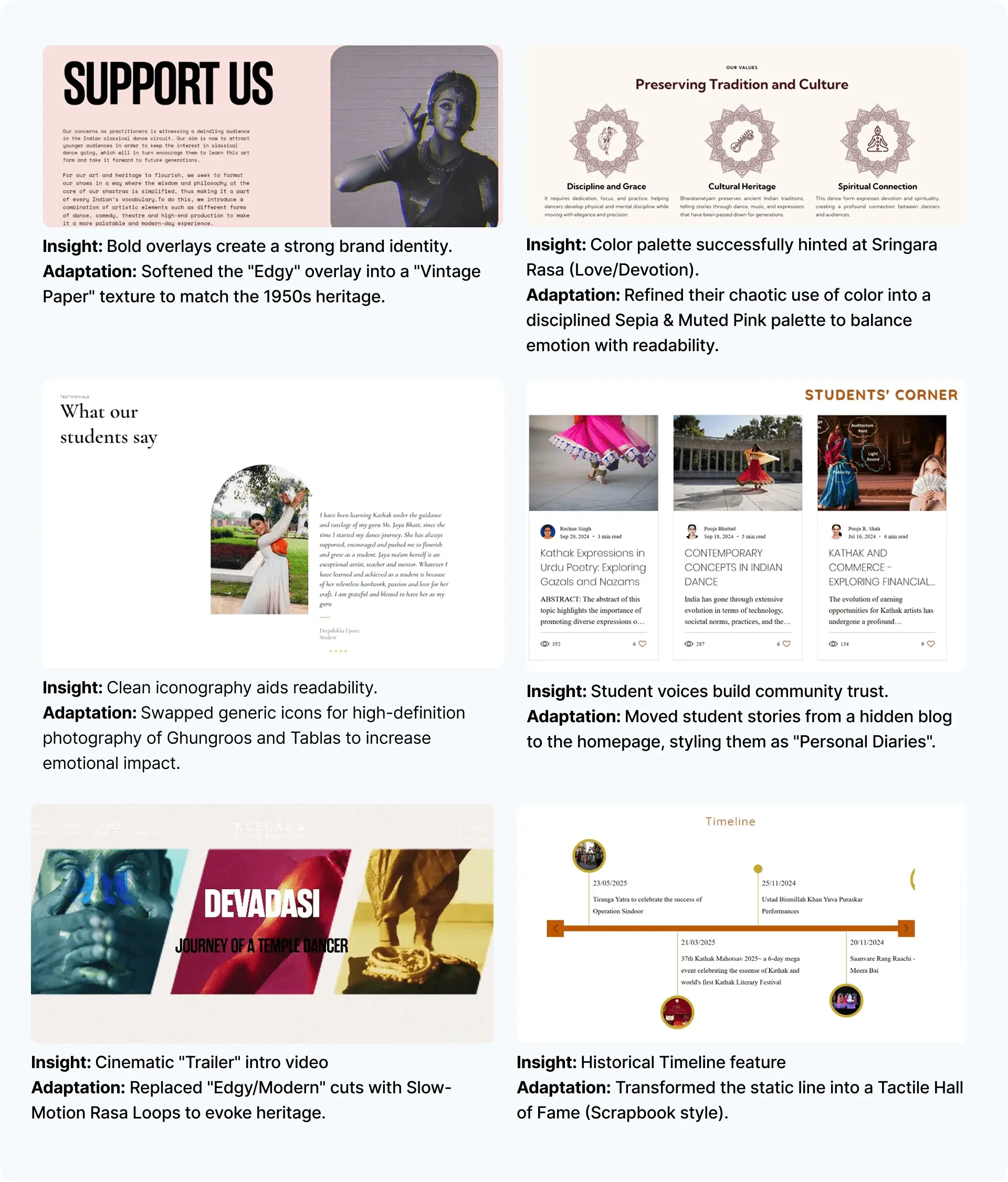
Visual Audit: Standard market features refined into atmospheric UI components
Collecting The Archives
Since the academy had no digital database, their history lived in physical Prospectus Books and annual reports. I analyzed these documents to extract critical trust markers: the Founder's role in the Freedom Struggle, the evolution of accessible Lucknow Gharana Kathak, lists of Ministers and Chief Guests for testimonials, and data on 16,000+ students for social proof.
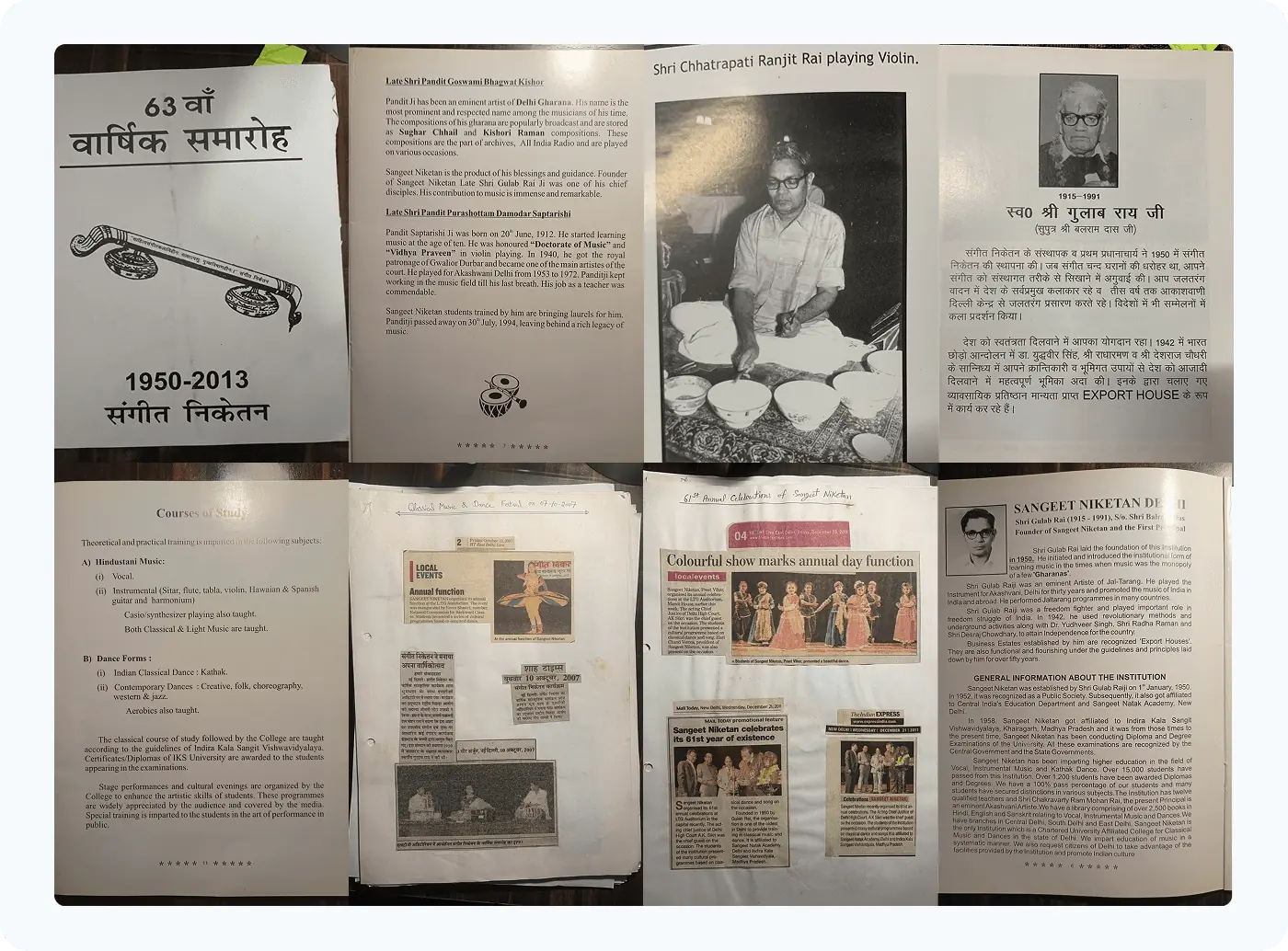
Raw Material Collection: Prospectus books, newspaper clippings, and annual reports
Synthesis
From Research to Form
The Noun Extraction Method
To ensure the website felt like an extension of the physical academy, I used a Noun Extraction Method. I listed physical objects found during my visits (the “Nouns”) and mapped them directly to User Interface elements.
Physical “Noun” (Source)
Digital Component (UI)
Old Newspaper Scrap
Testimonial Card
Used for social proof to look like archival clippings.
Photo Frames
Hall of Fame Gallery
A drag-interaction that mimics walking across the stage.
Ghungroo (Bells)
Raw Element
Used in dance course section to induce tactile nostalgia.
Notebook (Course Assignment)
Raw Element
Used in dance course section to induce tactile nostalgia.
Musical Instruments
Raw Element
Used in music course section to induce tactile nostalgia.
Attendance/Operation Log
Book Interaction
Used as digital book interaction that curates student testimonials, alumni journeys, and newspaper features into one narrative experience.
Carpets
Raw Element
Used to induce tactile nostalgia.
Visual Translation: From Rasa to Reality
Using the Sringara Rasa (Love/Beauty) as a guide, I brainstormed visual motifs — floral patterns, birds, and fluid curves — and filtered them into a “Soft & Temporal” aesthetic. This informed the color palette of Muted Pinks and the use of cursive typography to mimic the flow of dance.
To anchor that softness, I looked to the academy's physical architecture. I extracted tangible nouns — Wooden Frames, Jharokhas (Archways), and Vintage Paper — and translated them directly into UI components.
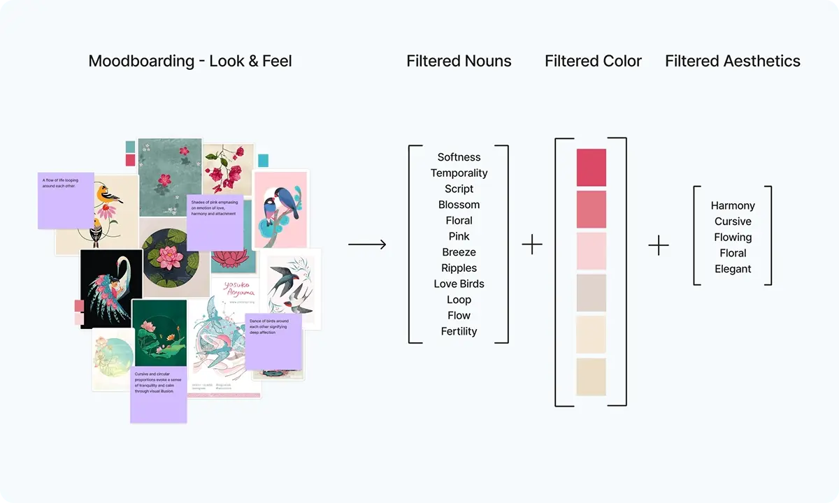
Look & Feel (Filtered Abstractions)
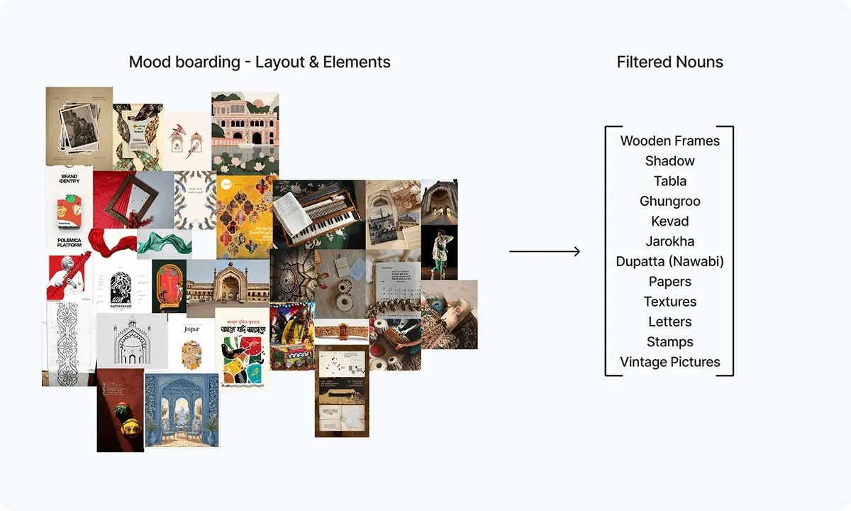
Layout & Elements (Filtered Abstractions)
The Translation: The “Wooden Frames” became our image containers, “Shadows” became our elevation system, and “Vintage Pictures” became the texture for our background layers.
Information Architecture: Before vs. After
Present Navigation Flow (Issues Identified)
Homepage
- Lack Flexibility
- Lack Readability
- Too much overwhelming
- Poor Color Choices
- Lack Hierarchy
- Lacks Information and Emphasis
- No Interaction
- Not used testimonials effectively
About Us
- Lacks User Feedback
- Bad Font
- Lack Pictures too much content
- Lacks Visual Language
- Lacks Facility Information
Academics
- Lacks User Feedback
- Bad Typography
- Lack Pictures too much written content
- Lacks Visual Language
- Information too much outdated
- Lacks organization
Events
- Lacks a lot of information
- Too much outdated
- Lacks Value
Departments
- Lacks User Feedback
- Bad Font
- Lack Pictures too much content
- Lacks Visual Language
- Information too much Outdated
- Lacks organization
Student Zone
- Lacks User Feedback
- Bad Font
- Lack Pictures too much content
- Lacks Visual Language
- Information too much Outdated
- Lacks organization
Gallery
- Outdated
- Poor Labeling
- Irrelevant Content
Footer
- Lacks Social
- Lacks Utility
Redesigned Navigation Flow
Landing Page
We skipped generic menus. The user is greeted by the academy’s philosophy immediately, setting the emotional tone (Rasa).:
Heritage
Interactive Archive: As the user scrolls, the ‘Polaroid Stack’ shuffles backward (Parallax), revealing the timeline from 1950 to Today.
Founder
Context before Content: We establish the 70-year legacy first. This builds the authority required to sell the courses later.
Academics
Structured Learning: Courses are presented not as a list, but as artistic disciplines. High-fidelity imagery replaces text-heavy descriptions.
Testimonials
Digitized Validity: We transformed static reviews into a ‘Scrapbook’ of newspaper clippings and student letters.
Annual Celebrations
Users explore the ‘Hall of Fame’ laterally, mimicking the experience of walking through a physical photo gallery.:
Footer
Frictionless Access: After the user is emotionally invested (Narrative), the contact form appears as a natural conclusion to the story.
Design Intent
From Abstract Culture to Concrete Interface
Designing for a 70-year-old cultural institution required more than just “modernizing” the layout. We needed to ensure every interaction preserved the essence of the Lucknow Gharana. This funnel illustrates the rigorous distillation process — how we filtered broad ethnographic research into specific, tangible UI features.
△The Narrative Thread (Structure)
□The Emotional Thread (Rasa/Aesthetics)
○The Heritage Thread (Tactile/Validity)
Contextual Enquiry & Desk Research
△
Gat Bhava(Narrative Walk)△□
Abhinaya(Expressive Storytelling)□○
Krishana Performances(Romantic & Devotional)△
Katha & Kathakar(Story & Storytelling)Brainstorming & Moodboarding
△□○
Sringara Rasa(Indian Aesthetic – Love)□○
Physical Instruments & Materials△○
Narrative & Immersive Design△
Vertical Flow(Narrative Walk)△□○
Sepia & Beige Color Palette△□○
Timeline & Hall of Fame△□○
Digitizing Old HeritageTracing the Design Threads
To ensure traceability, every decision follows one of three core threads derived from the research:
The Narrative Thread
Structure
We translated the "Gat Bhava" (The Dancer’s Narrative Walk) directly into the website’s Information Architecture. The Vertical Flow and Parallax Scroll guide the user through the academy’s history without the friction of clicks.
The Emotional Thread
Aesthetics
We mapped the "Sringara Rasa" (The Sentiment of Love/Beauty) to our visual language. This moved us towards a Sepia & Beige Palette that evokes warmth, affection, and nostalgia.
The Heritage Thread
Features
We addressed the "Trust Gap" by converting the academy’s physical history (Nawab Patronage) into digital proof. This led to Digitizing Old Heritage newspapers and creating a tactile Hall of Fame Timeline.
Vector Restoration
To close the “Trust Gap,” we needed to digitize physical newspaper clippings and archival photos. This 4-stage restoration process converted raw scans into polished UI assets while preserving the original character.
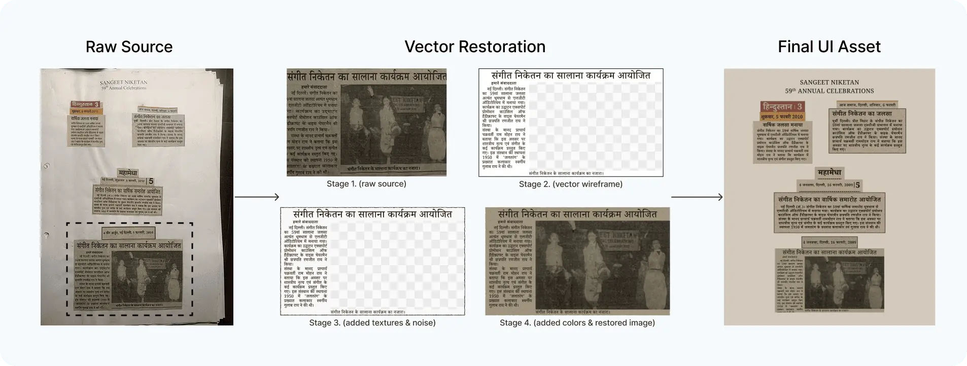
Vector Restoration: Raw Source \u2192 Vector Wireframe \u2192 Textures & Noise \u2192 Final UI Asset
Outcome
The Digital Rangmanch
Static pixels cannot convey the “Gat Bhava” (Narrative Walk). I used Parallax scrolling and easing transitions to mimic the physical sensation of walking through the academy — slow, rhythmic, and atmospheric.
Note: This project's scope has been expanded. The solution cycle is still under development — what you see represents one iterative design cycle.
A. The Invocation (Hero Section)
Instead of generic navigation, the user is greeted by a high-fidelity video loop. The typography (Noto Serif) acts as the narrator, inviting the user into the story.
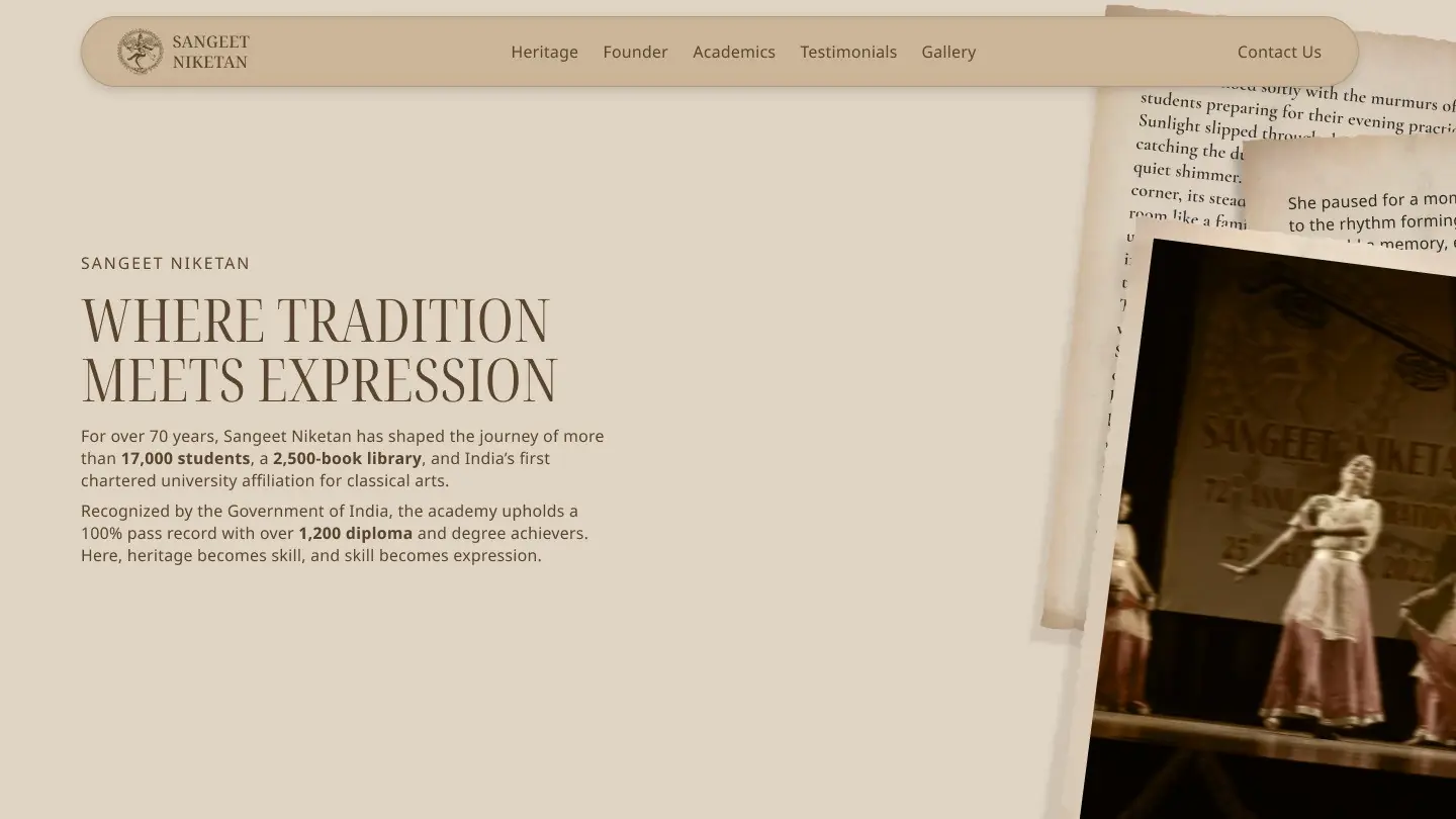
The Invocation: Immersive hero with video loop and serif typography
B. The Evolution (Heritage Timeline)
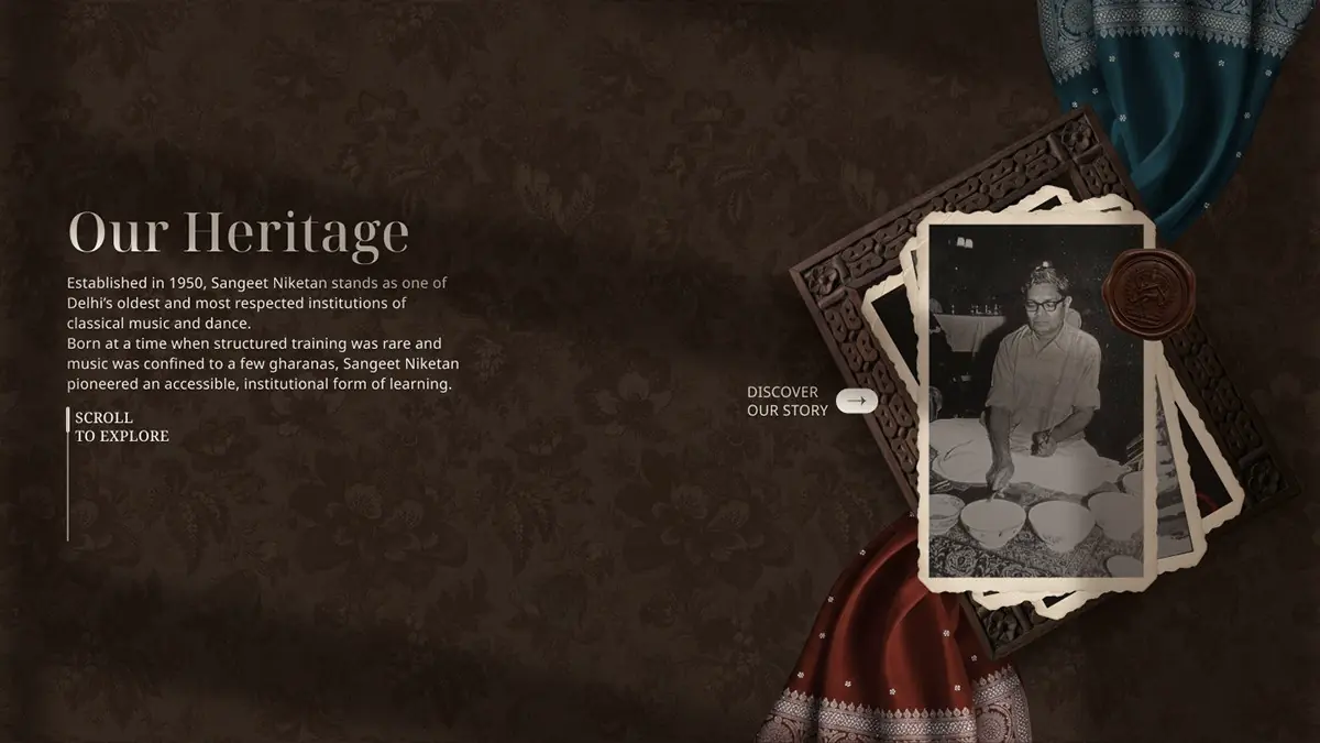
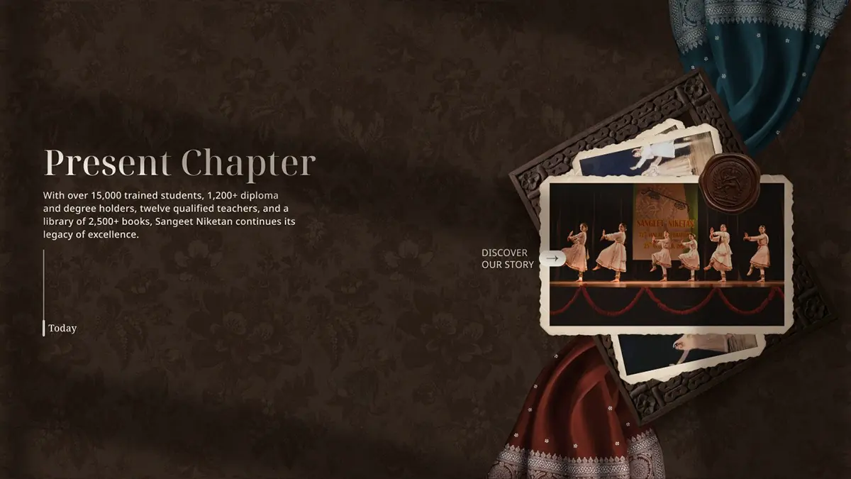
Standard timelines are boring. We replaced the chronological list with an interactive “Polaroid Stack.” As the user scrolls, the top photo slides away to reveal the next era — from “The Beginning (1950)” to “Present Day (2025)” — mimicking the physical act of flipping through an archive.
Beginning (Heritage Flow)
Present Chapter (Heritage Flow)
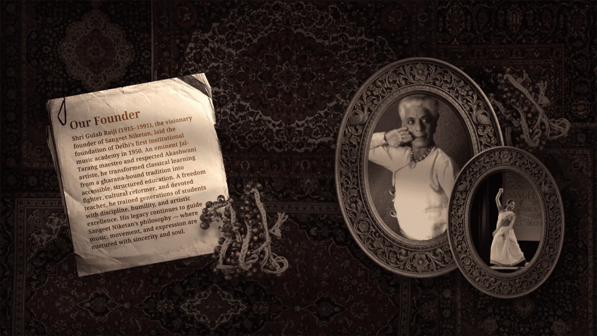
C. The Roots (Founder Section)
Applying our Noun Extraction, we used a “Carpet Unrolling” animation to introduce the Founder. As the user scrolls, the background elements shift (Parallax), creating depth behind the “Legacy Text.”
The Roots: Carpet Unrolling animation with parallax depth
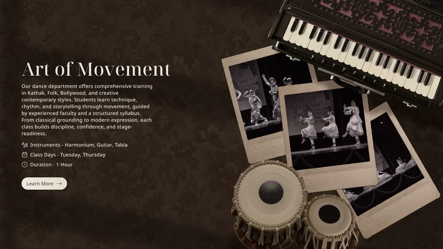
D. Dance (Art of Movement)
Instead of using generic vector icons for “Dance,” we used high-fidelity photography of Ghungroos (Ankle Bells) lying on an open manuscript. This connects the digital course description back to the physical sound and texture of the classroom.
Art of Movement: Ghungroo photography with manuscript background
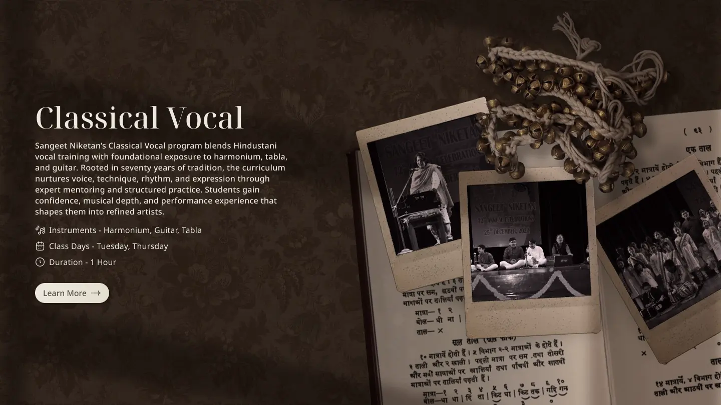
E. Music (Classical Vocal)
We utilized a “Broken Grid” layout where the Harmonium and Tabla break the container boundaries. This creates a 3D effect, making the instruments feel like they are sitting on top of the floral wallpaper background, adding depth to the scroll.
Classical Vocal: Broken Grid layout with instrument photography
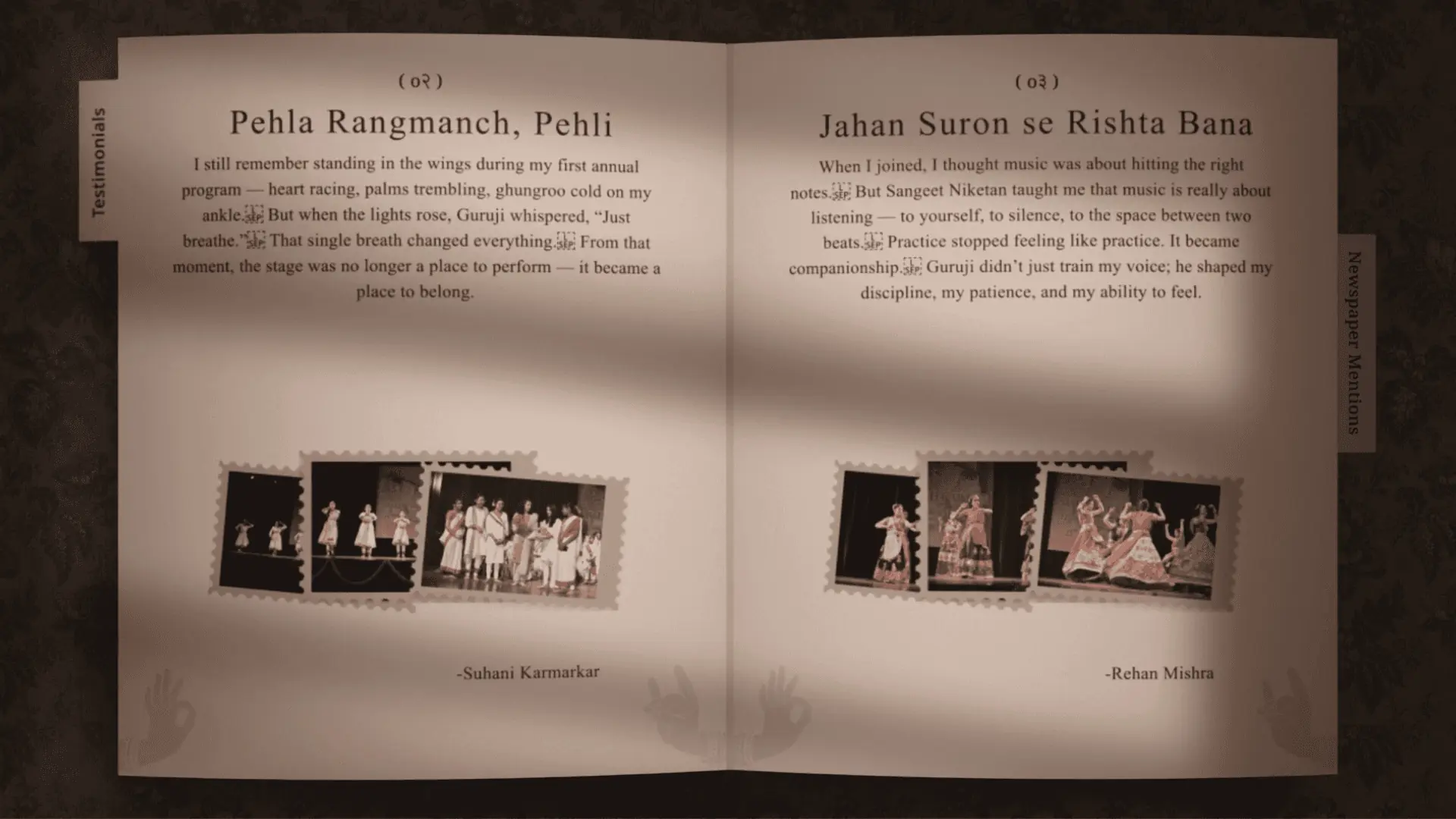
F. The Evidence (Archives & Testimonials)
This is where the “Trust Gap” is closed. By placing the digitized newspaper vectors next to student letters, we transformed a standard review section into a Historical Record.
The Evidence: Digitized newspapers alongside student testimonials
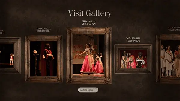
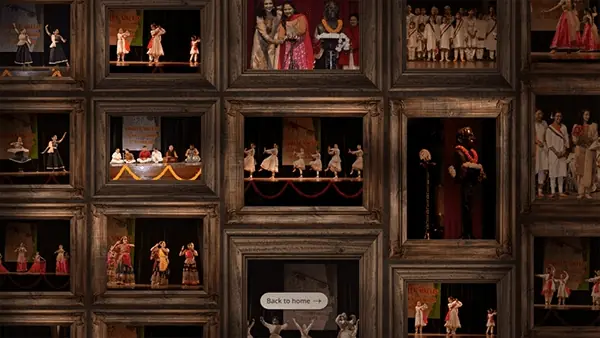
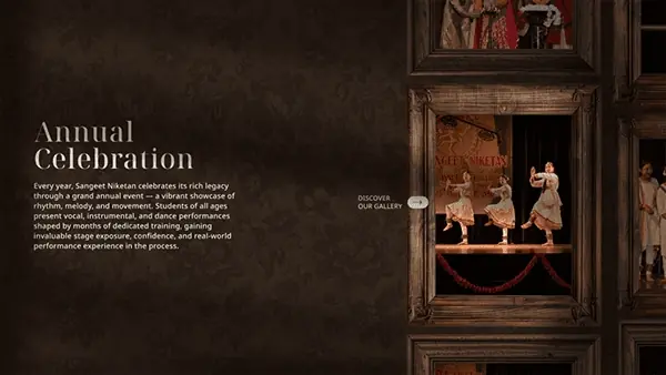
G. The Stage (Gallery)
To break the vertical rhythm, we introduced a horizontal drag interaction. The “Wooden Frame” UI components (extracted from physical research) give the digital photos a tactile, museum-like quality.
Atmosphere is Function
In standard UX, "efficiency" is the metric. In Cultural UX, "Emotion" is the metric. For a heritage brand, friction (like a slow scroll or a texture) isn’t a bug; it’s a feature that forces the user to slow down and respect the content.
The Archeologist Mindset
The biggest design assets weren’t on Dribbble — they were in a dusty filing cabinet. Contextual Inquiry (physically visiting the site) provides richer design inputs than any digital competitive analysis ever could.
Designing for Development
Translating heavy textures and parallax effects into code highlighted the importance of asset optimization. Balancing "High-Fidelity Aesthetics" with "Page Load Performance" is a constant negotiation.
Future Scope
The development cycle of this project is currently in process with various active pipelines. Here's what's next:
01
User Stories Platform
Creating a dedicated space where students, alumni, and families can share their personal stories with the heritage — turning the site into a living archive of community memory.
02
Asset Optimization Pipeline
Shrinking image sizes through automated compression and format conversion (WebP/AVIF) to maintain high-fidelity aesthetics without sacrificing page load performance.
03
Automated Page SEO
Building an automated SEO pipeline — structured metadata, Open Graph tags, and schema markup — so every page is discoverable and properly indexed.
04
Responsive Design
Extending the desktop-first design to a fully responsive experience across tablet and mobile, preserving the atmospheric parallax and narrative flow at every breakpoint.