Map Editor: Map Planner dashboard with system health metrics
Map Editor: Floor plan editor with rooms and objects
Map Editor: Space change reporting form with priority levels
Navigation Interface: Mode selection with Study, Travel, Shadow, and Emergency options
Navigation Interface: Active navigation showing Walk Straight 10m instruction
Navigation Interface: Video support with live camera feed for human assistance
The Indoor Navigation Crisis
Indoor spaces are architecturally hostile to people who cannot see. GPS drops to over 10 meters of error the moment you walk through a door. Existing navigation apps assume the user can read a map, follow a blue dot, or glance at a screen mid-walk. For a blind user carrying a cane, none of that applies.
The gap is not just technical. It is emotional. One wrong instruction in an unfamiliar hallway does not just add 30 seconds to a journey. It destroys the user's trust in the entire system. And once trust is broken, the user stops relying on the app and starts relying on strangers. The technology failed its one job: to give someone independence.
The challenge was to build a navigation system where the positioning layer works without GPS, the feedback layer works without vision, and the recovery layer works without abandoning the user when things inevitably go wrong.
Understanding the Landscape
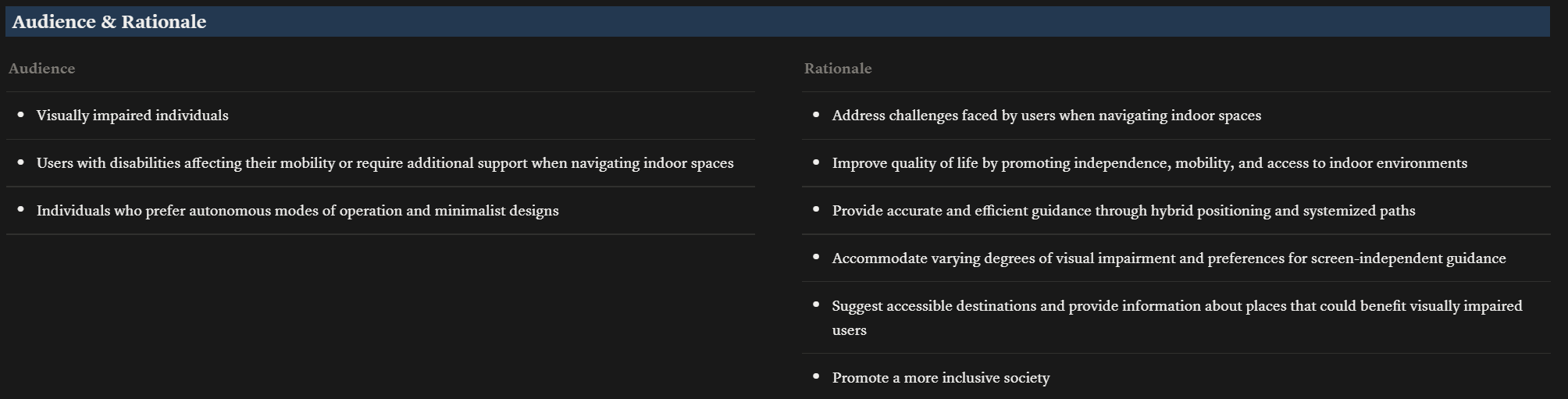
Idea Communication and Audience
The project started with a core philosophy: navigation should be as tactile and accessible as braille itself. I mapped the target audience, their rationale for needing indoor navigation, and defined the product scope before any design work began.
Competitive Audit
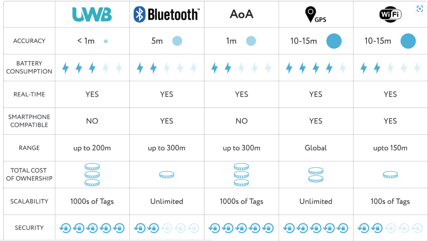
I studied Be My Eyes (relies entirely on human volunteers, no autonomous navigation), Google Maps (visual-first, no indoor routing, no haptic feedback), and Navigine (freemium vendor lock-in, limited accessibility features). None of them solved the core problem: giving a blind user independent, real-time indoor navigation with non-visual feedback.
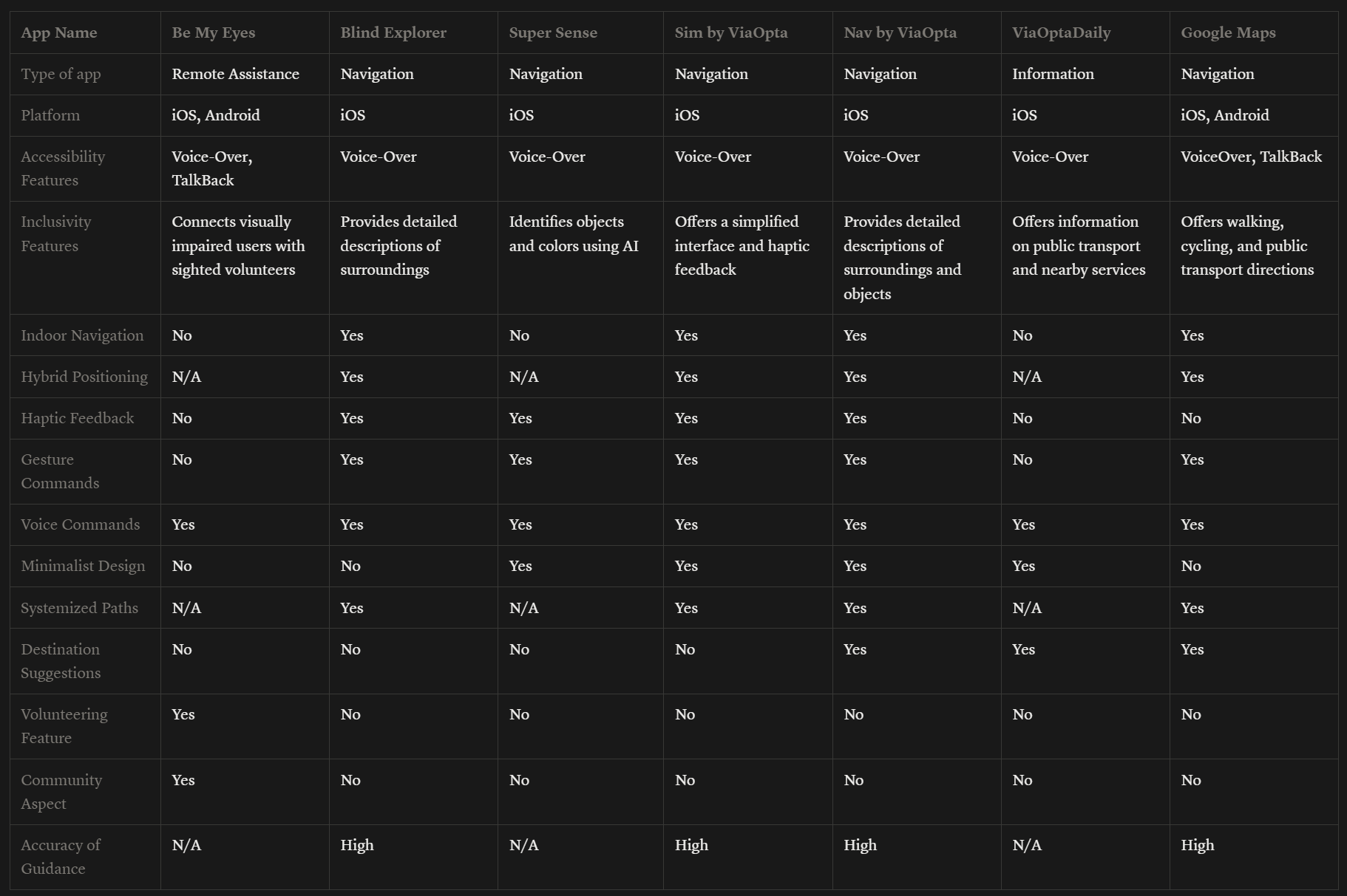
Competitive audit mapping feature gaps across existing solutions
Three User Personas
Research identified three distinct user archetypes, each requiring different levels of guidance and different interaction preferences.
Visual Impairment Research
I catalogued 8 types of visual impairment and mapped each to specific UI adaptations. Total blindness requires 18-point minimum fonts with audio-first interaction. Low vision users need 28-point fonts with high contrast. Color blindness requires an accessible palette that avoids red-green combinations. Every design decision passed through the filter: does this work without sight?
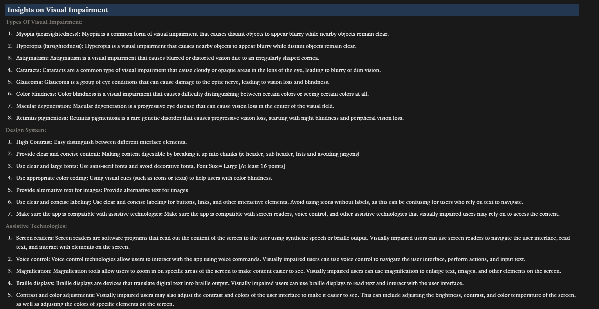
Insights on visual impairments mapped to design system requirements
Design System Study for Accessibility
I studied existing design systems to understand how accessibility requirements translate into component-level decisions. High contrast color schemes, minimum touch target sizes, screen reader compatibility patterns, and font scaling requirements all fed into the system design.
Technology Stack Decision
Android was chosen over iOS because iOS restricts background Wi-Fi scanning, which is critical for continuous indoor positioning. The primary positioning engine uses Wi-Fi fingerprinting (Anyplace SDK) because it works with standard Wi-Fi hardware already installed in buildings. When Wi-Fi scans are throttled by the operating system (Android limits scans to 4 per 2 minutes), step-counting sensors fill the gap using pedestrian dead reckoning. A mathematical filter continuously blends both data sources to produce the smoothest possible position estimate.
From Research to System Logic
Research finding: Blind users cannot process visual directional cues. Voice-only guidance creates cognitive overload when the user is also listening for environmental sounds like footsteps, doors, and echoes.
Design response: I created a vocabulary of six distinct vibration patterns. Each pattern feels fundamentally different, not just louder or softer. A left turn is a double-knock. A right turn is a sustained pulse. A wall boundary is a grainy sandpaper buzz. The user learns this dictionary during onboarding and then navigates primarily by touch.
Research finding: Positioning accuracy drops significantly near metal structures like elevators and in areas with thick concrete. Wi-Fi signals bounce and create false location readings.
Design response:Instead of hiding this uncertainty, I made it a first-class design material. The Confidence Index drives every aspect of the system. When accuracy is high, the system speaks directly: "Turn left now." When accuracy drops, the system hedges: "I think a left turn is coming up." The haptic texture also shifts from a solid pulse to an irregular flutter so the user can literally feel the system's uncertainty.
Research finding:Users who receive blaming language after a navigation error ("You missed the turn") show significantly lower willingness to continue using the system compared to users who receive neutral language.
Design response:I built a "dignity layer" into the recovery system. When the user drifts off-path, the system says "I might be mistaken. Did we pass the turn?" The system takes responsibility for the confusion. It recalculates the route silently in the background and only announces the new path once it is confident. Three consecutive successful instructions are required before the system returns to its normal confidence tone.
Edge Case Evaluation with ECE
To systematically identify failure points before they reached users, I ran the system design through ECE (Edge Case Evaluator), a structured evaluation tool I built specifically for forcing AI and design thinking to map consequences before proposing solutions. ECE's approach (Map, Expand, Validate, Audit, Synthesize) produced 55 edge cases across 12 failure dimensions: perception breakdowns, system accuracy failures, feedback channel failures, cognitive overload, behavioral variability, trust erosion, interaction constraints, environmental volatility, infrastructure issues, social interruptions, arrival ambiguity, and meta failures like phone drops and app crashes. Each edge case was traced to its worst-case outcome and paired with a specific mitigation strategy that fed directly into the system design.
The Wireflow: Six Phases of Navigation
The entire navigation experience maps to six phases. Each phase has a defined system action, a specific haptic signature the user feels, and a corresponding user action.
The Confidence Index
The system's positioning confidence (a score from 0 to 1) modulates everything: the haptic texture, the voice tone, the word choice, and even the routing strategy.
Designing for Trust
Dignity Over Efficiency.The system never blames the user. When navigation goes wrong, the technology is the one that was confused, not the person. Recovery language like "I might be mistaken" preserves the user's sense of competence. This is not just politeness. Research shows that self-blaming language from assistive technology directly correlates with abandonment rates.
Chunked Cognition.No instruction contains more than two sequential steps. "Walk 10 meters, then wait" instead of "Walk 10 meters, turn left, then turn right." Silent periods between instructions let the user hear environmental cues like echoing hallways, door hinges, or crowd noise. These natural landmarks are often more reliable than the technology itself.
Confidence Transparency.When the system is uncertain, it says so. "My signal is weak, instructions might be less precise." This prevents the worst outcome: the user trusting a confident-sounding instruction that turns out to be wrong. Transparent uncertainty builds more long-term trust than false certainty.
Multi-Modal Redundancy. Every instruction is delivered through two independent channels: voice and vibration. If the environment is noisy, haptics carry the message. If the user misses a vibration through thick clothing, voice fills the gap. The two channels reinforce the same instruction simultaneously without competing.
The Haptic Dictionary
Six patterns make up the complete vibration language. Each was designed to feel distinct from all others, even through clothing, even while walking.
The Complete Experience
A. Establishing Tone
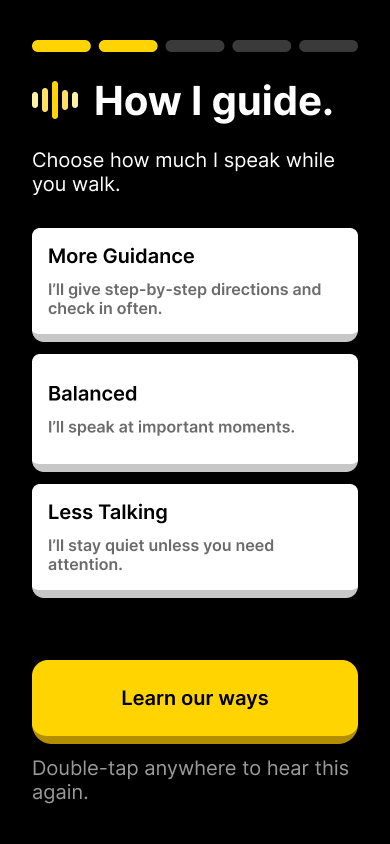
Research finding: First-time users of assistive navigation apps report high anxiety during onboarding. The first 30 seconds determine whether the user continues or uninstalls.
Design response:The splash screen is high-contrast black with minimal elements. The welcome screen introduces the system in first-person voice: "I will help you navigate indoors using sound and touch." A "Talking Model" selection lets the user choose how much the system speaks, giving them control from the very first interaction.
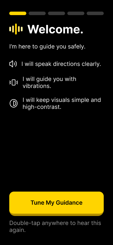
"Double-tap anywhere to hear this again" provides TalkBack redundancy on every onboarding screen
B. The Gesture Lab
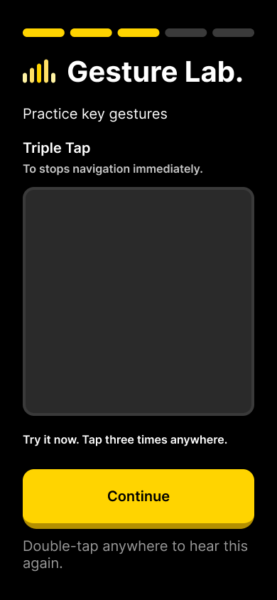
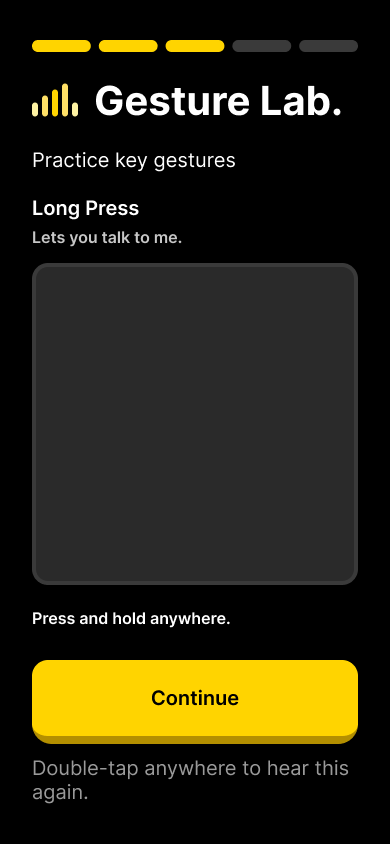
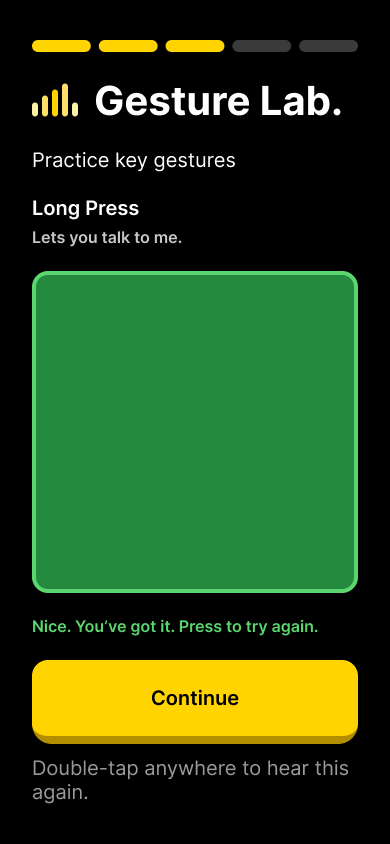
Research finding: Blind users often have both hands occupied (cane in one hand, bag in the other). Traditional touch interactions like swipe and pinch are impractical during navigation.
Design response:I designed two primary gestures that work without precise targeting. Triple-tap anywhere on the screen is the emergency abort (stops all navigation and sound immediately). Long-press anywhere activates voice assistant mode. Both work regardless of where the user's finger lands. The onboarding includes a practice area where the user rehearses each gesture until the system confirms they have it right.
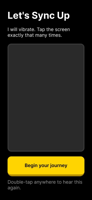
C. Haptic Calibration
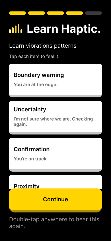
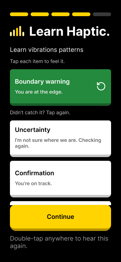
Research finding: Haptic patterns are only useful if the user can distinguish them. Vibration perception varies by device model, phone case thickness, and individual sensitivity.
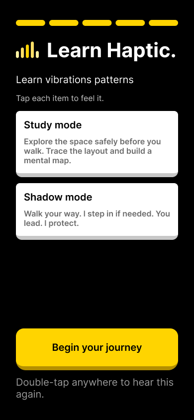
Design response:Before navigation begins, the user goes through a haptic calibration screen where they tap each pattern to feel it. A "Didn't catch it? Tap again." retry option ensures every pattern is learned. The onboarding also introduces Study Mode (trace the map with your finger to build a mental model) and Shadow Mode (you lead, the system follows silently and only alerts to hazards).
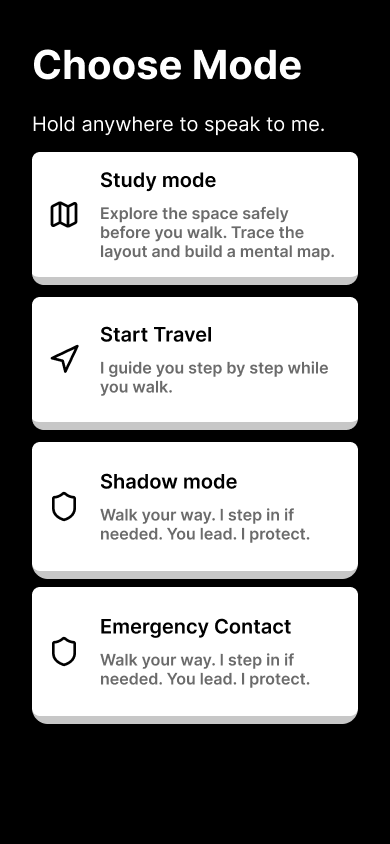
D. Mode Selection and Emergency Setup
Research finding: Users have different autonomy preferences. Some want full guidance; others know the general direction and just want positioning confirmation. Forcing one mode on all users reduces adoption.
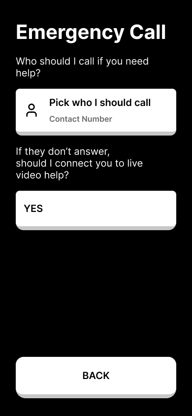
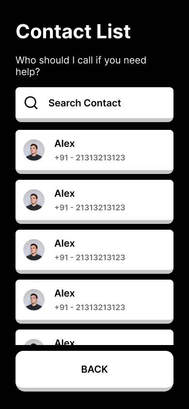
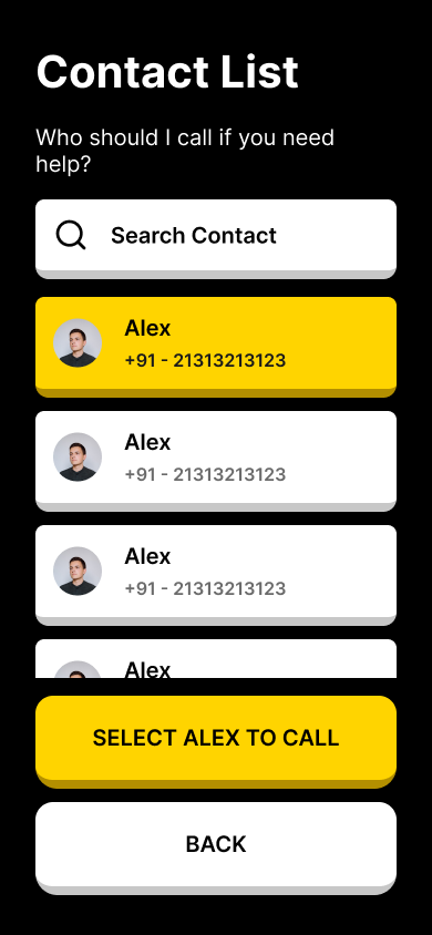
Design response:Four distinct modes let users choose their level of system involvement. Study mode lets them explore the map before walking. Travel mode provides full turn-by-turn guidance. Shadow mode follows silently unless there is a hazard. Emergency mode prioritizes safety with immediate human escalation. The emergency contact setup includes a multi-layer fallback question: "If they don't answer, should I connect you to live video help?"
E. Active Travel
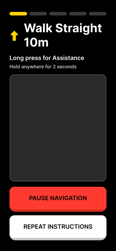
Research finding: Cognitive overload during walking is the primary cause of navigation errors. Stacking more than two instructions causes the user to lose track of where they are in the sequence.
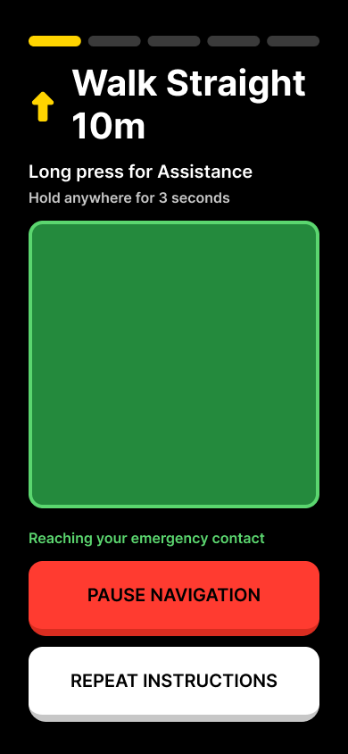
Design response:The active navigation screen shows one instruction at a time in large text with a directional arrow. Instructions are capped at two sequential steps maximum. A red "Pause Navigation" button and white "Repeat Instructions" button are always visible at the bottom of the screen. "Long press for Assistance" is persistently available. Behind the scenes, Wi-Fi positioning and step-counting sensors are continuously fused through a mathematical filter that produces real-time position updates.
The core navigation screen. One instruction. One direction. Always-visible controls.
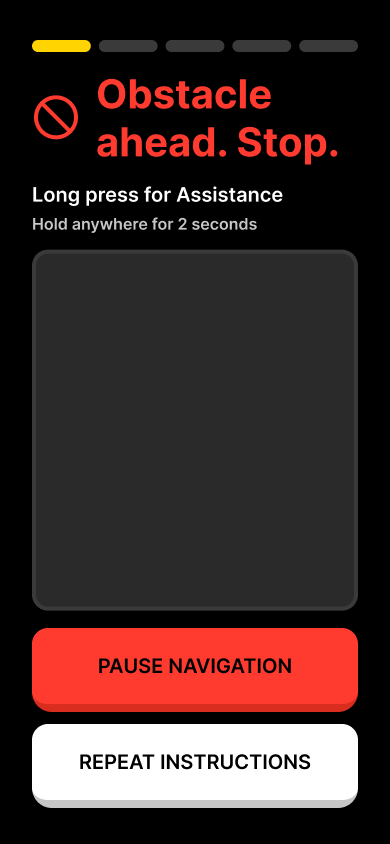
Research finding: When obstacles appear unexpectedly, panic response is immediate. The user needs unambiguous stop signals, not gentle suggestions.
Design response:The obstacle detection screen shifts to red, the universal danger color. A prohibition icon and "Obstacle ahead. Stop." in red text leave no ambiguity. The system auto-pauses navigation and delivers three rapid haptic stabs. It does not just warn. It stops. The system then recalculates a route around the obstacle before resuming guidance.
F. Human-Centric Recovery
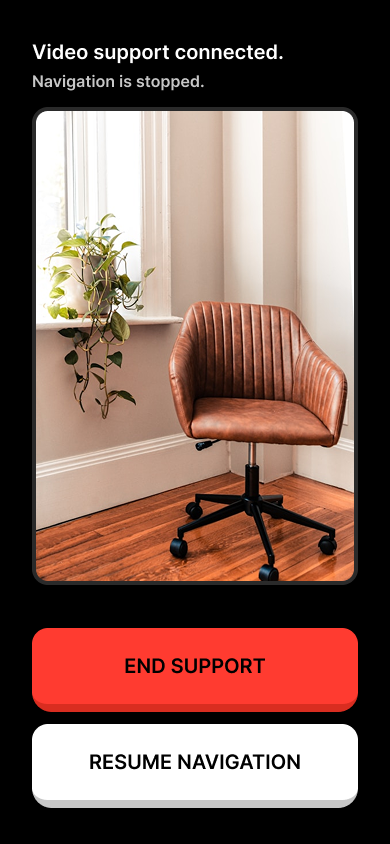
Research finding: The biggest fear of blind users using navigation technology is being abandoned when the technology fails. Every existing solution has a single point of failure: if the app crashes or loses signal, the user is on their own.
Design response:I designed a three-layer fallback system. When the user requests help, the system first calls their emergency contact with a live video feed. If the call fails, it automatically sends a text message with the user's indoor position. If the contact is unreachable, it connects to a remote video assistance service. At no point is the user abandoned. Each escalation happens automatically, with clear status messages so the user knows what the system is doing.
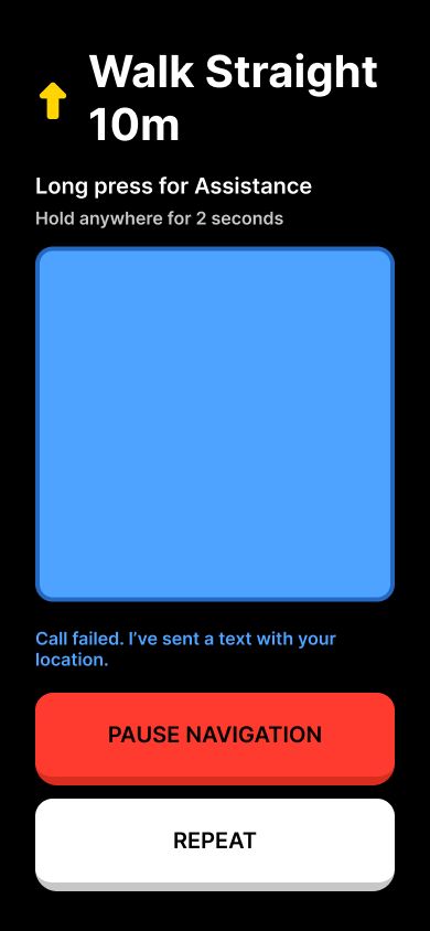
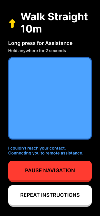
Three layers of escalation. The user is never abandoned.
G. The Map Planner
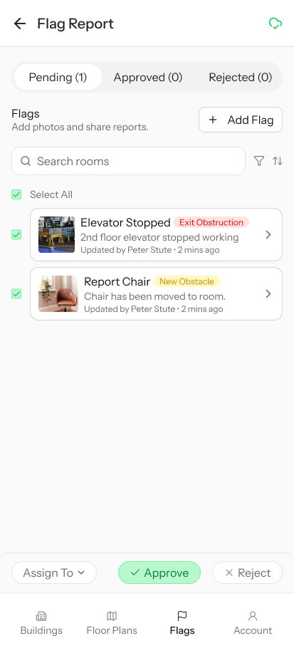
Research finding: Map accuracy directly determines navigation safety. If the digital map does not match the physical building, the user gets routed into walls, blocked paths, or non-existent doors.
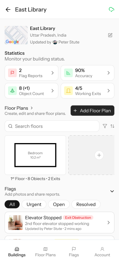
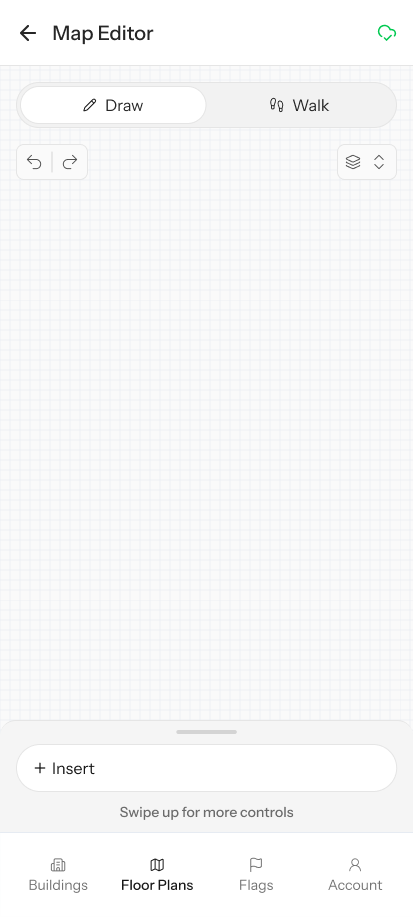
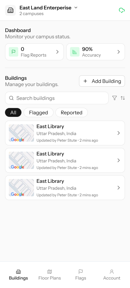
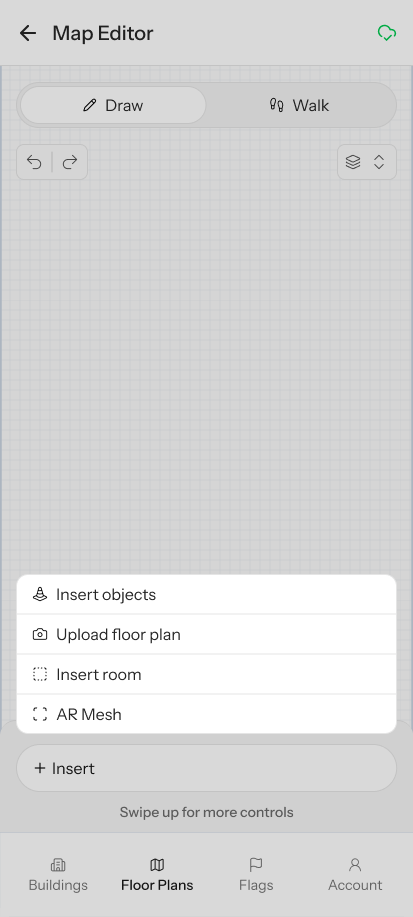
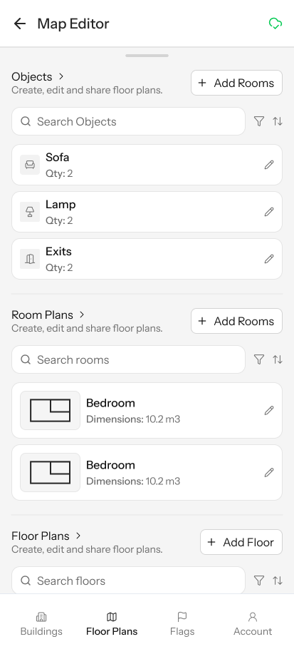
Design response: I designed a separate companion app for building administrators and helpers. The Map Planner provides four ways to create indoor maps: Draw (manual precision on a grid), Walk (physically walk the space and trace your path using the same step-counting technology the blind user navigates with), Upload (overlay an existing floor plan image), and AR Mesh (use the phone camera to scan the room in 3D). A dashboard shows system health metrics including flag reports, accuracy percentage, object count, and working exits.
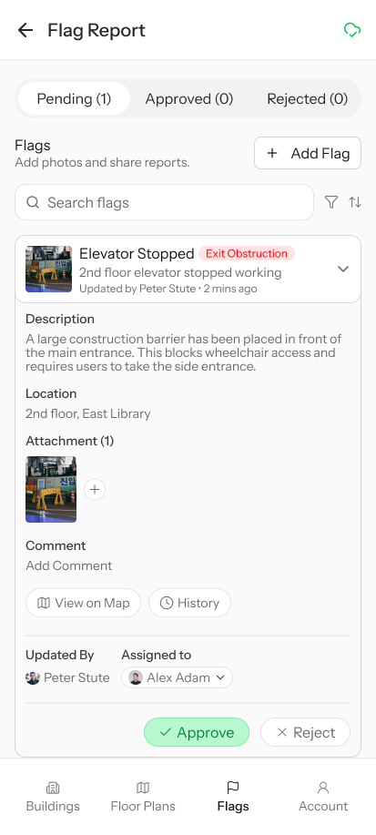
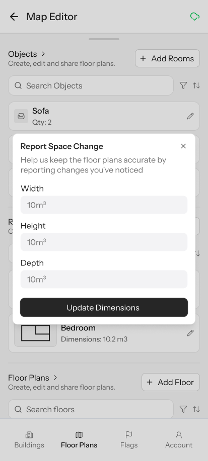
Research finding: Maps decay over time. Furniture moves, temporary obstacles appear, paths get blocked for maintenance. Static maps become dangerous.
Design response: A flag reporting system lets anyone (users, helpers, building staff) report space changes. Flags have types (exit obstruction, new obstacle), priority levels, and a lifecycle (Pending, Approved, Rejected). When an admin approves a flag, the map updates and the navigation routing engine immediately reflects the change. The next blind user who walks that path gets accurate guidance.
Map Planner raw Figma design showing the full admin interface
Design Iterations
The UI went through two full iterations. The first iteration was wireframed before the backend logic existed. The second iteration, designed in Figma, was driven by the system behavior requirements, specifically how each phase of the wireflow maps to what the user sees and feels on screen.
First iteration wireframes
Second iteration in Figma Make, shaped by backend phase requirements